

Extending CloudGlance's platform into a calm website - designed and built to grow with the product
After designing the CloudGlance platform and shaping its identity, I took on its public presence end to end: the information architecture, the design system, the motion, and the full front-end build.
The brief was simple to say and harder to hold: give a deep, document-heavy platform a calm, confident website that could explain it clearly and keep growing alongside it. What I built is less a set of pages than a system - a small hierarchy of page templates, a library of reusable blocks, and a motion layer that brings the product to life - assembled so the site can scale as CloudGlance does.
- Role
- Product Designer & Front-End Developer
- Timeline
- Jan 2025 - Present
- Industry
- Enterprise SaaS, Document Intelligence
- Platform
- Web
- Stack
- Figma, Next.js, React, TypeScript, Tailwind CSS, Framer Motion
- Deliverables
- Information Architecture, Design System, Page & Motion Systems, Full Front-End Build
Context
CloudGlance had evolved. The platform was structured, the identity was refined, and it was ready for real enterprise use - but publicly, none of that was visible. The company was still running on an old single-page site, built on the previous identity - and no longer reflecting the brand, the product, or the maturity of the work behind it.
Because I had already shaped the platform and its identity, I understood the domain, the workflows and the message. Taking the website end to end was a natural continuation rather than a handoff.
The real design problem wasn't making a site look good. It was translating a deep, deliberately calm product into a public-facing site that still had to do marketing's job (persuade, explain, build trust) without ever raising its voice. And it had to keep pace with a product that was still growing.
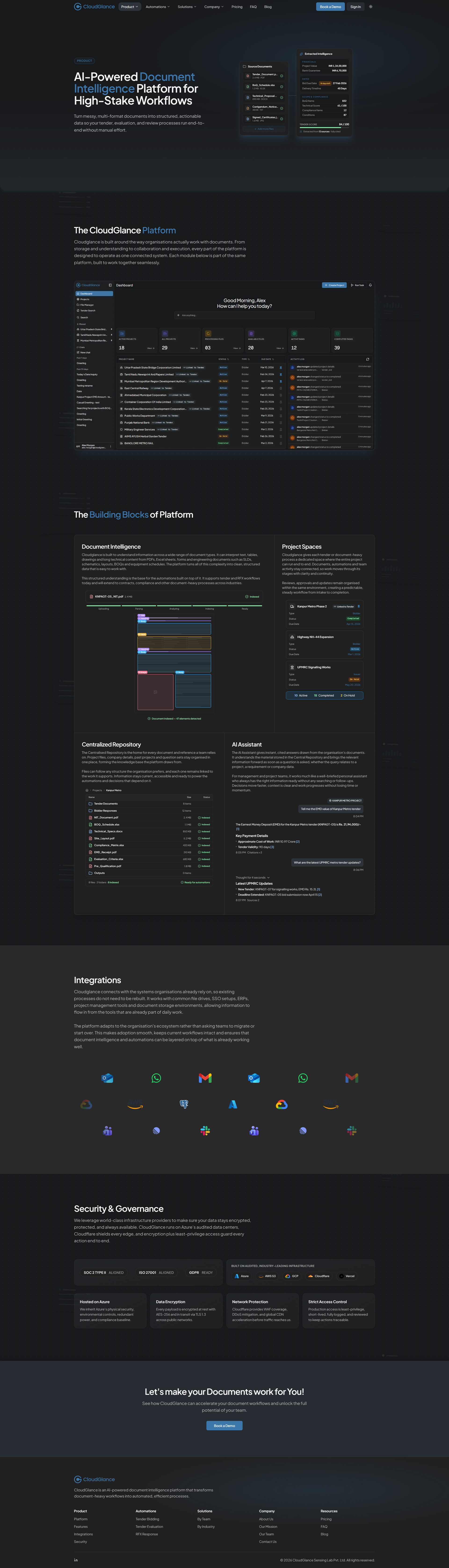
The Problem
The previous website couldn't support CloudGlance's next stage. A single-page layout on the old identity, with no room to explain the platform's depth, no real narrative, and none of the trust signals enterprise buyers expect before handing sensitive documents to a tool.
It needed to do far more: explain the product clearly, speak to different kinds of buyers, communicate security and readiness, and match the mature identity we had established inside the product. And it had to scale - absorbing new features, automations and pages over time without a redesign each time.
In short, CloudGlance needed a website that could grow with the product and tell a calm, credible story to people who value clarity over noise.
The previous single-page site
Everything the platform had become, flattened onto one long scroll - built on the old brand, with no structure to explain the depth and nowhere to grow.
Approach
I worked the project in clear phases, each one setting up the next - from understanding the need, to structuring it, to designing it, to building it.
Discovery & Requirements Alignment
Before designing anything, I spent time understanding what the website actually had to achieve. The team shared their expectations, the limits of the old single-page site, and the gaps they saw in how the product was being represented. That clarified both the functional and the narrative requirements: what the site had to explain, who it had to speak to, and what confidence it needed to build.
Because the platform and identity work were already done, I came in with a clear grasp of the workflows, the user types and the decision points. That context set the direction: a structure that could communicate depth without overwhelming, in the same calm, mature tone we had established inside the product.
Information Architecture & Site Mapping
With the requirements clear, I structured the site itself. I mapped a full sitemap - primary pages, internal detail pages, navigation patterns, and how different buyers would move through it. The goal from the start was a system, not a landing page: something that could scale as CloudGlance added automations, industries and depth.
The architecture gave each piece of information a home - the homepage for the broad narrative, product and automation pages for technical detail, solutions for role-based clarity, and company pages for trust - and I planned expansion paths so new pages could slot in without breaking the structure. This became the framework everything else was designed and built on.
Structural Exploration & Low-Fidelity Design
Once the structure was set, I explored how each page could take shape - mapping how sections would stack, how information would group, and how components could stay consistent across contexts. This stage was about logic more than aesthetics: finding patterns that felt clear, predictable, and straightforward to build later.
I approached layout as a system of modular blocks from the outset. Each block had to work on its own and in combination with others, which is what would later make the site easy to scale and simple to assemble in code. These early wireframes set the rhythm of the site and kept the narrative calm and readable before any visual design began.
Visual System & High-Fidelity Design
With the structure in place, I moved into high-fidelity design. Before refining visuals, I shared the low-fidelity layouts with the team and requested real content for each section, based on the structure I had designed - so the messaging aligned to the architecture rather than being retrofitted later.
As content came in, I identified gaps, clarified missing points, and iterated the layouts to support the narrative more effectively. The visual direction followed the platform's identity: calm typography, composed spacing, and a restrained use of the brand's blue. Screen visuals and section blocks were added only where they strengthened understanding - used to clarify, never to decorate. By the end of this phase the site had a complete visual system, ready to build.
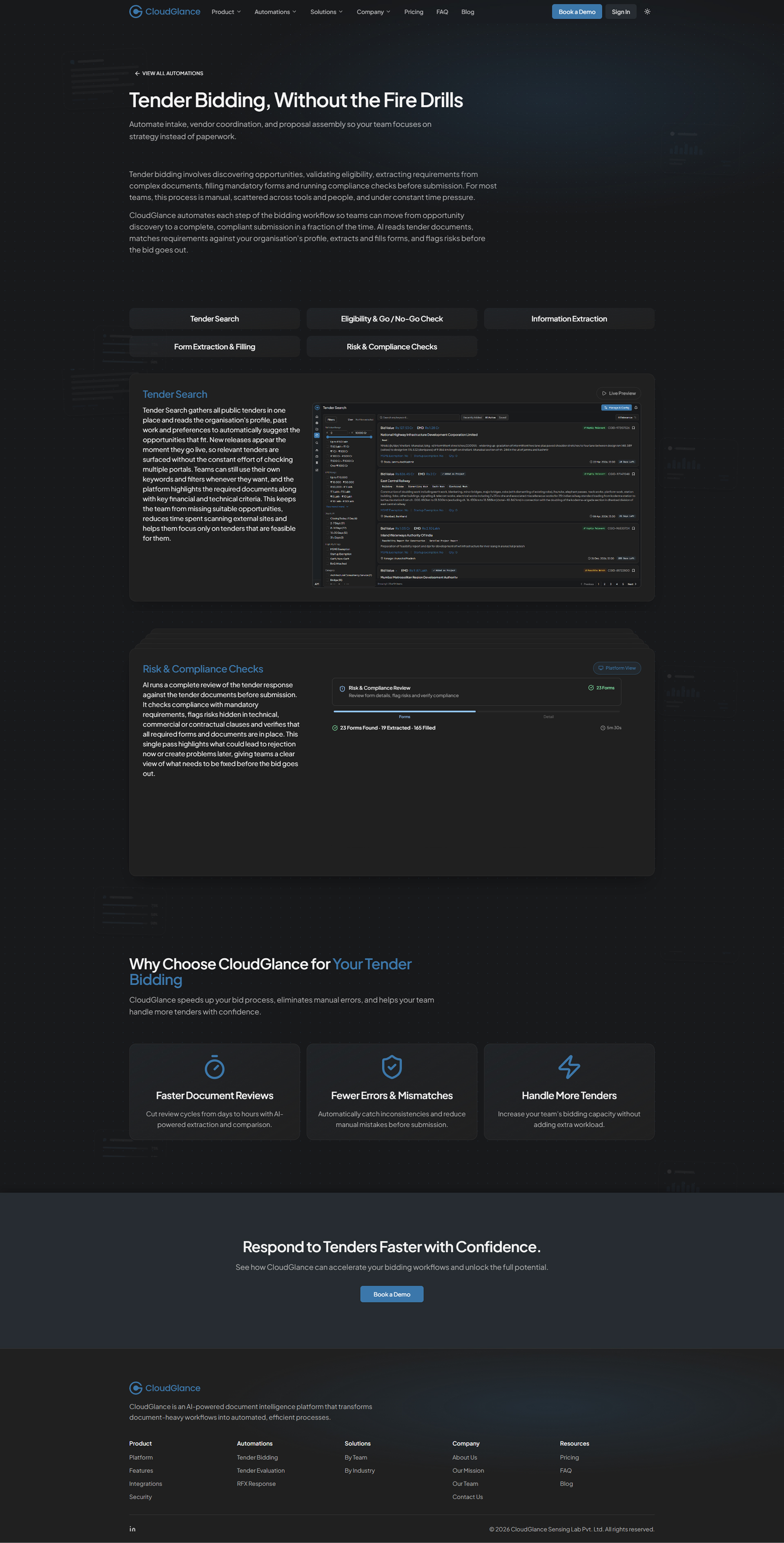
The Page System
I didn't design pages - I designed the system they're built from, so the site could grow with the product instead of being redrawn for it.
A product like CloudGlance keeps moving - new automations, new audiences, new things to explain. A site built as a set of hand-made pages can't keep up with that; every addition becomes a small redesign. So from the first structural decision, I treated the site as a system: a small set of page templates and reusable blocks that any new page assembles itself from. The site should be able to grow without anyone having to reinvent it each time.
A Framework of Three Page Types
Primary, secondary, tertiary - every page is built from one of three templates.
Rather than let each page define its own shape, I structured the whole site around three templates, scaled to how much narrative weight a page carries.
- Primary is the homepage - the full story, opening with the animated hero and moving through a deliberate sequence of sections to the closing call-to-action.
- Secondary is the main pages - Product, Automations, Solutions and Company. One rhythm: a focused hero, a series of content sections, a closing CTA. Different content, same skeleton.
- Tertiary is everything a level down - the internal automation pages, Pricing, FAQ, the Blog and its articles, and Contact. The simplest template: a page header, the focused content, and a closing CTA. It carries the widest range of pages on the least structure.
Contact is the one intentional exception within that tier - the same page header, but a two-column functional layout and no closing CTA, because its job is to end the journey, not extend it.
Because the tiers are fixed, a reader senses where they are from how a page is shaped - and no page ever starts from a blank canvas.


Blocks That Map Straight to Code
The modular blocks in the design are the components in the build.
Underneath the templates is a library of section blocks - heroes, feature grids, split feature rows, tabbed sections, testimonial rails, accordions, calls-to-action. I designed each as a self-contained block and built each as a reusable component, so there is no translation gap between design and code: a page is composed the same way in both.
A single layout primitive, one section wrapper with a few surface variants, gives every block consistent spacing, which is why the site holds a steady vertical cadence from top to bottom without tuning it page by page. New sections drop into that cadence on their own.
Built to Grow - and It Already Has
The real test of a scalable system is what happens when you add to it.
A structure that scales is easy to claim and hard to prove - so the proof is in what the site already holds. The same three templates now carry a marketing narrative, a product overview, a full pricing page, a content library, tertiary automation pages and functional support pages - a wide spread of page types, none of which needed a new layout.
New automations slot in the same way: a live one like RFX Response sits beside coming-soon entries like Contract Review and Engineering Search inside the identical pattern, so the site can show what is next without waiting for a redesign.
As CloudGlance keeps expanding, the website expands into the structure that is already there. That was the intention - build the system once, and let growth be a matter of filling it in.
Designing the Product in Motion
The platform is abstract until you see it move - so I designed its motion as a language, not decoration.
CloudGlance does most of its work in places a still frame can't reach: reading long files, extracting fields, structuring information, reasoning across documents. A screenshot shows a result; it doesn't show the work. So alongside the product screenshots, I designed and built a motion layer with one job - make an abstract system legible, and keep it quiet enough that it never gets in the way.
Every animation on the site is mine, built in code, and built as part of the same system that shaped the pages - not added on top once they were done.
Motion Principles
Motion earns its place, or it doesn't ship.
The platform's tone (calm, composed, unhurried) had to survive the move to a marketing site, where motion is usually the loudest thing in the room. I held it to a few rules.
It arrives on scroll, only where it is needed, and always in service of meaning: things move the way the underlying process actually flows, so the animation explains rather than performs. It stays out of the reader's way - soft easing, quiet timing, nothing competing with the words beside it. The main hero plays through once and settles; the smaller showcases loop gently, so their few steps stay readable whenever you arrive.
The site should feel like it is breathing, not flashing.
The Hero - A Product Coming to Life
The first thing a visitor meets is the platform, mid-thought.
The homepage hero isn't an image or a headline over a gradient. It's a composed, dimensional scene I built to show CloudGlance doing its actual work.
An application window sits at the centre; around it, result cards (an extracted bid package, a compliance check, an L1 evaluation, source documents) surface and settle, joined by flow lines that trace how information moves from raw files into structured output, with a pipeline strip beneath keeping the sense of a system running.
It all reveals in sequence, so a first-time visitor watches the product's core idea assemble itself in a few seconds, before reading a single line of copy. A lot of moving parts, held to the same calm rule as everything else.
One Scene, Three Forms
The same hero, rebuilt for the screen it lands on - not stretched to fit.
A scene this involved can't behave the same everywhere, so I gave the hero three forms.
- On desktop it's fully interactive: the whole composition sits on a perspective plane and tilts to follow the cursor, so it feels dimensional and alive as you move across it.
- On tablets, that depth and pointer-tracking fall away - the same scene renders flat and still, a calm 2D version, because a subtle 3D tilt on a touch screen reads as fussy rather than refined.
- On mobile, where the full composition simply can't fit, the hero becomes a separate build of its own: a compact scene that loops through the same story one phase at a time, and settles quietly for anyone who prefers reduced motion.
Three forms, one idea - each designed for how its screen is actually used, not scaled down from the one above it.
Tablet - the same scene, flattened and still
Mobile - a separate build that loops
Secondary Heroes & Section Signatures
Every main page opens with its own quiet signature.
The inside pages didn't need the homepage's full performance - that tires quickly across a whole site. They needed rhythm. So Product, Automations, Solutions and Company each open with a lighter, largely still hero visual tuned to its subject - intelligence for Product, running tasks for Automations, teams for Solutions, a constellation of people for Company.
Same family, same restraint, one clear accent per page: consistent enough to feel like one site, distinct enough that you always know where you are.
The Showcase System - Explaining the Platform, Not Just Naming It
A set of small, self-contained machines, each built to make one capability obvious.
This is the largest part of the motion work, and the most deliberate. Wherever a feature or automation needed explaining, I built a showcase - a small animated component that demonstrates the capability instead of describing it.
Tender search narrowing a list. Form extraction pulling fields from a document. Risk and compliance surfacing flags. L1 evaluation ranking bidders. An evaluation rubric filling in. RFQ matching and deviation scoring. Indexing turning raw files into something the system can act on.
Each one makes the same point: how a task that sounds complex is actually done in CloudGlance in a few simple steps. They run on the same two custom hooks (one that sequences the steps, one that starts the sequence when it scrolls into view) and then loop, so those few steps replay gently and stay readable whenever a reader arrives. Built as one system, they share timing, behaviour and restraint, which is why a whole library of separate animations still reads as one site rather than a pile of widgets.
Together they carry the real weight of showing what CloudGlance does - not by describing it, but by letting you watch how little it takes.
Brand Translation to Web
Extending the identity, not reinventing it.
The website extends the identity I had built for the platform rather than inventing a new one - the same calm, composed language, carried into a public setting where restraint is rarer. Typography, spacing and colour follow the same principles: clarity over decoration, quiet over noise, long-form readability first.
Blue, the brand's primary colour, stays deliberately sparing, with soft neutrals doing most of the work, so the few accents actually land. The site carries full light and dark themes, both built on the same restraint.
And because the section blocks mirror the platform's own components, the whole ecosystem (product, website, brand) reads as one continuous surface rather than three adjacent ones.
Colour


Typography


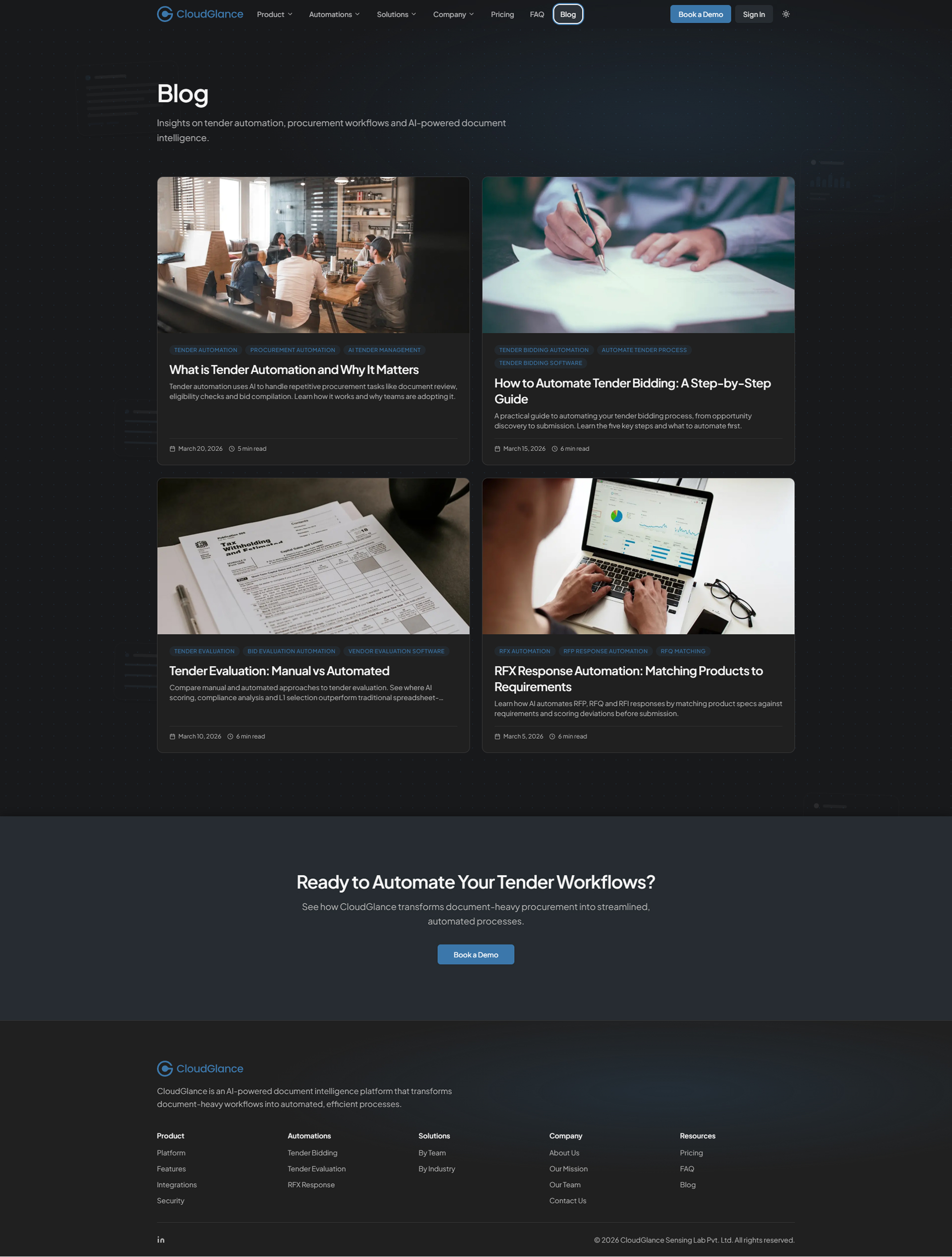
The Site, Page by Page
With the systems in place, each page became a matter of decisions rather than layouts - what to say, in what order, and how much to show. A walk through the site, framed by the choices behind each page.
Homepage
The homepage carries the full narrative, and I sequenced it deliberately. It opens with the animated hero and a short platform demo, establishing what CloudGlance is and grounding it immediately in something real. From there the story builds one step at a time: what changes with the platform, a four-step workflow explaining how it works, a preview of the available automations, and an enterprise-ready section covering security, integrations and governance. Testimonials and client logos add proof, a concise FAQ answers the obvious questions, and a final call-to-action closes.
The order is the design. Each section earns the next, so a first-time visitor is persuaded by a sequence, not a pile of claims.
Product Page
The Product page is the calm bridge between the homepage's narrative and the deeper automation pages. It opens with a secondary hero, then anchors understanding with a look at the platform itself before breaking it into its building blocks (document intelligence, project spaces, the repository, the assistant), each paired with a simple visual and a concise description.
Integrations and a dedicated security and governance section reinforce enterprise readiness, naming the real infrastructure and posture behind the product rather than gesturing at it. The page closes toward deeper engagement.
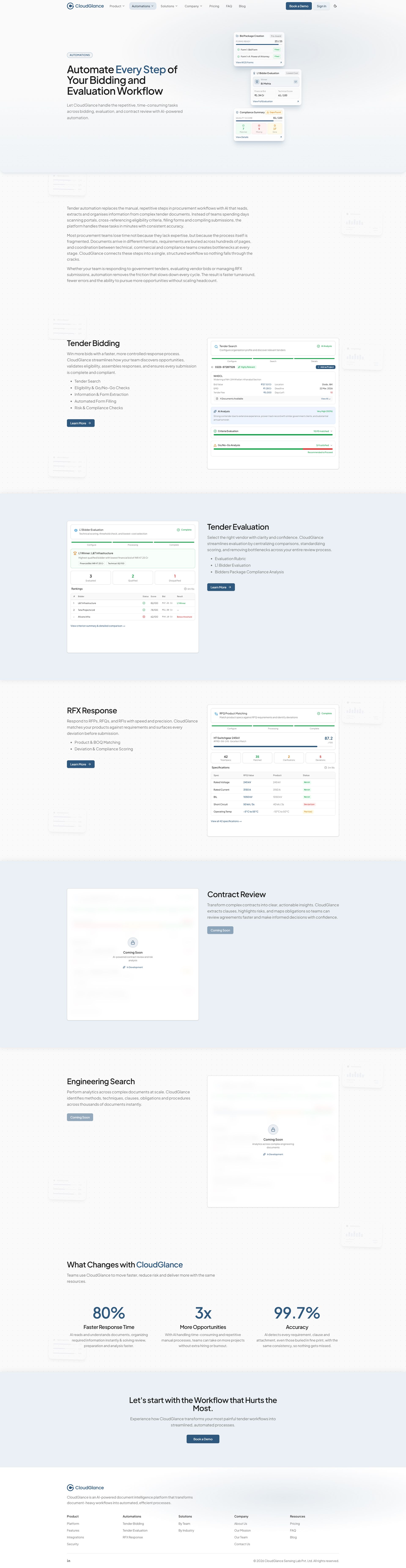
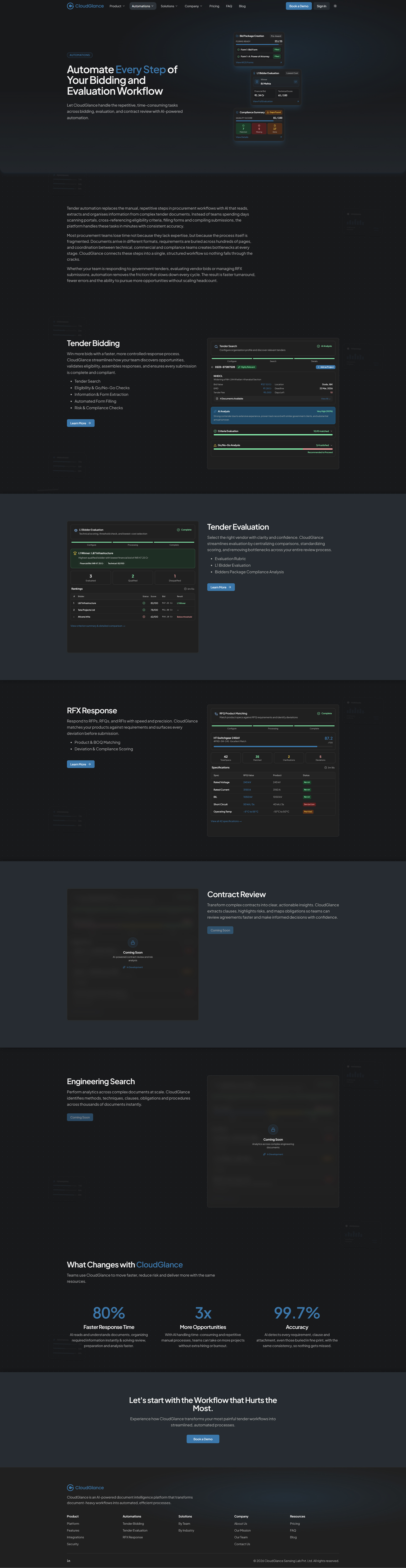
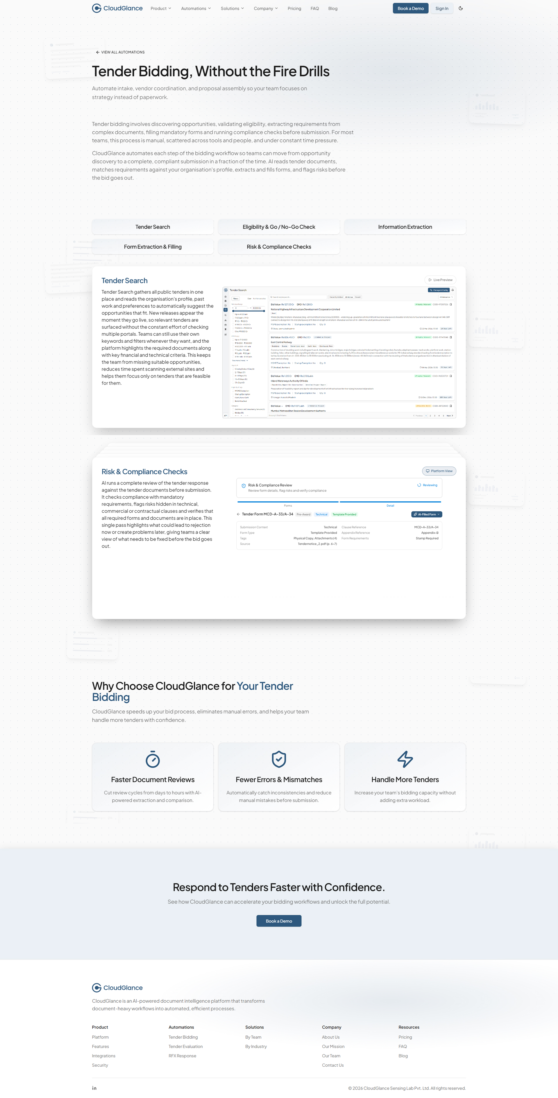
Automations
Automations is a two-level system, and the clearest place the page framework earns its keep. The main page introduces the platform's workflows (Tender Bidding, Tender Evaluation and RFX Response), each with a concise explanation and a showcase, alongside a look at what is coming next, like Contract Review and Engineering Search, shown honestly as upcoming rather than hidden.
Beneath it, each live workflow has its own internal detail page on the tertiary template: a page header, task cards describing the specific tasks inside that workflow, and a short closing section. It is the same template applied three times - and ready for the fourth. As CloudGlance adds workflows, they slot into this structure without a new layout, which is exactly what the section was built to do.
Automations page
Automation detail
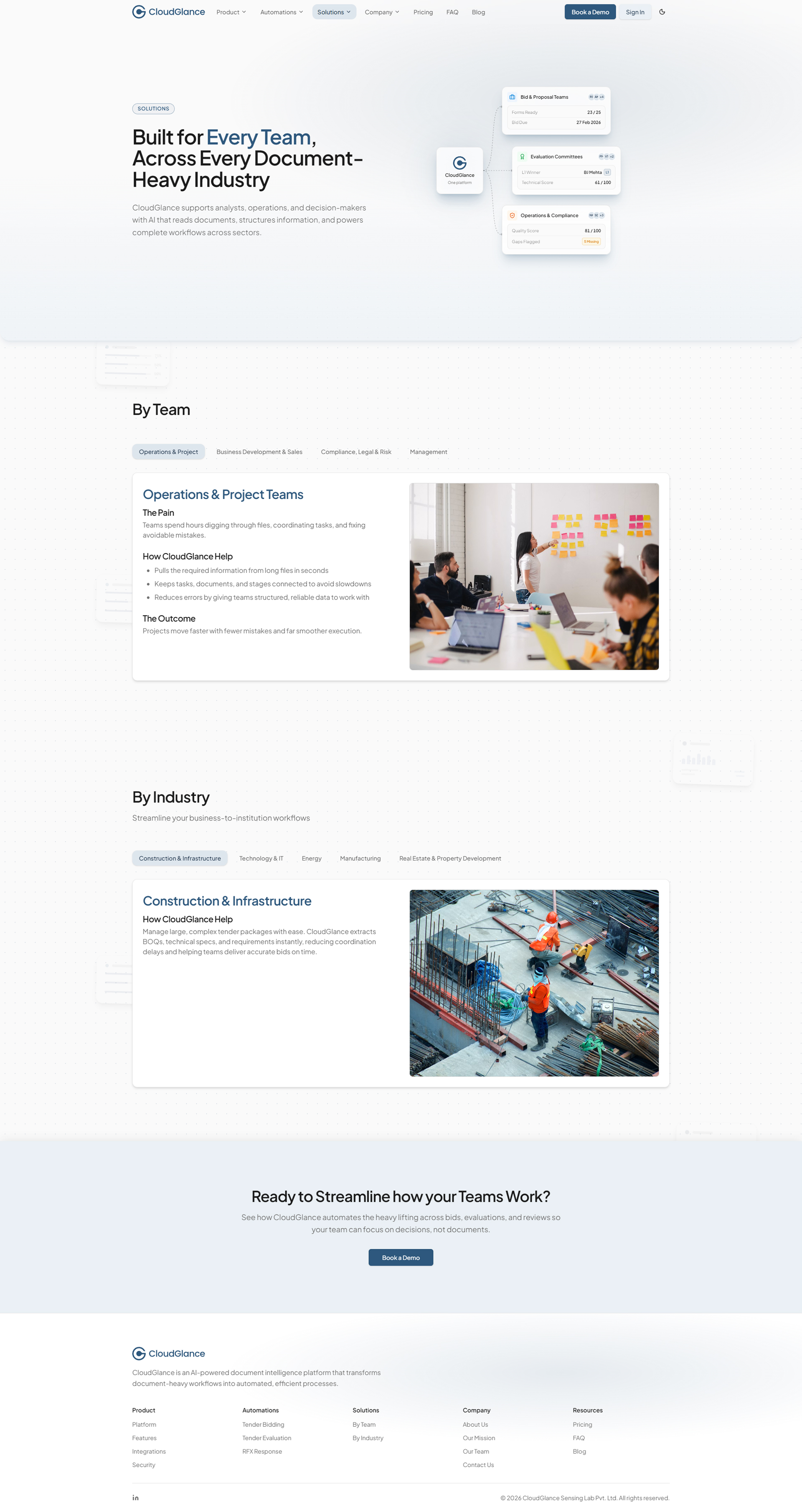
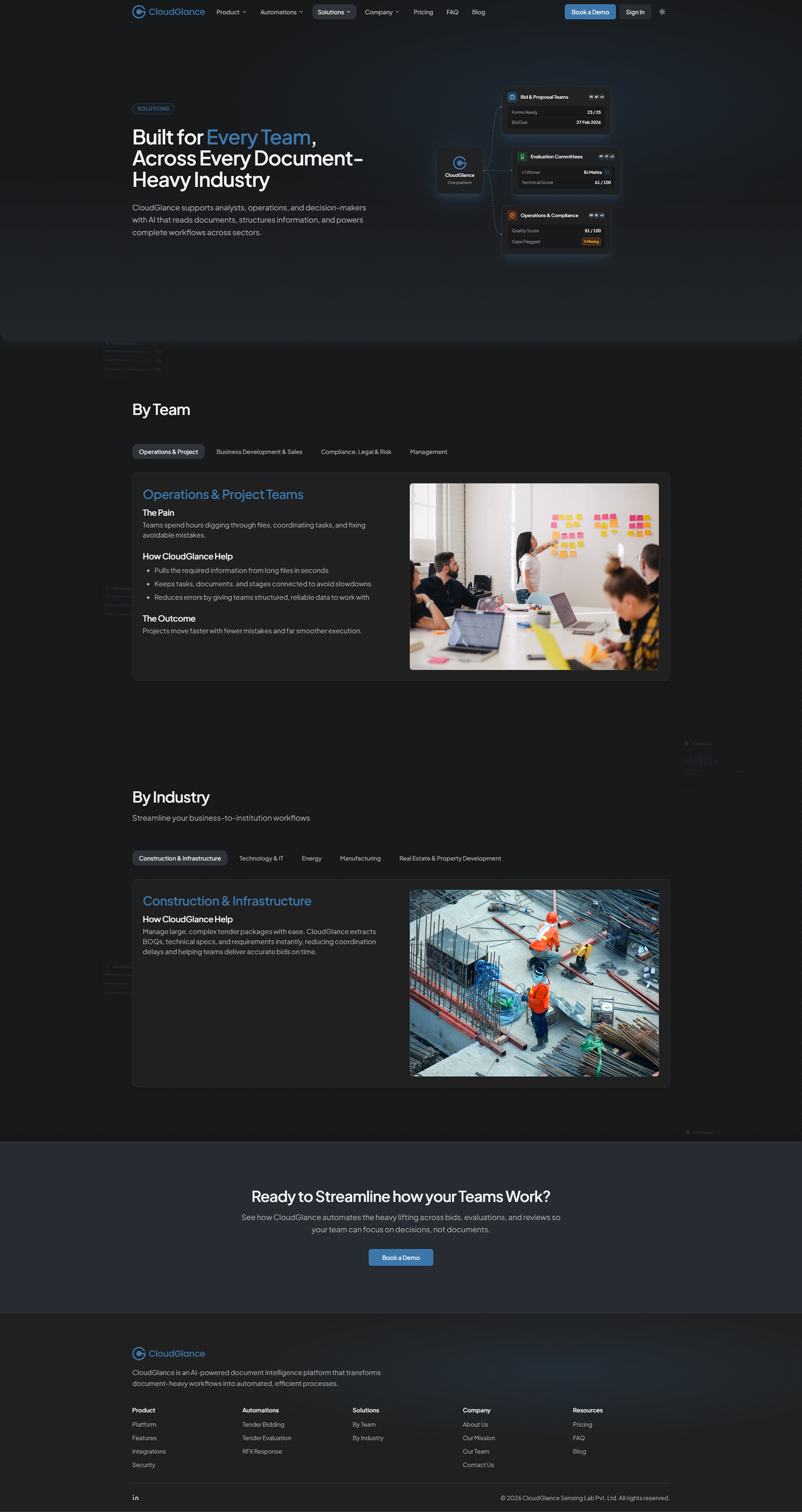
Solutions Page
The Solutions page lets different audiences read CloudGlance from their own vantage point. A dual view, By Team and By Industry, lets a visitor switch between two complementary ways of finding relevance, each pairing a short, contextual explanation with a visual.
The layout stays consistent across both, and new teams or industries are cards that drop into the existing structure - so the page is relevant today and inherently expandable tomorrow.
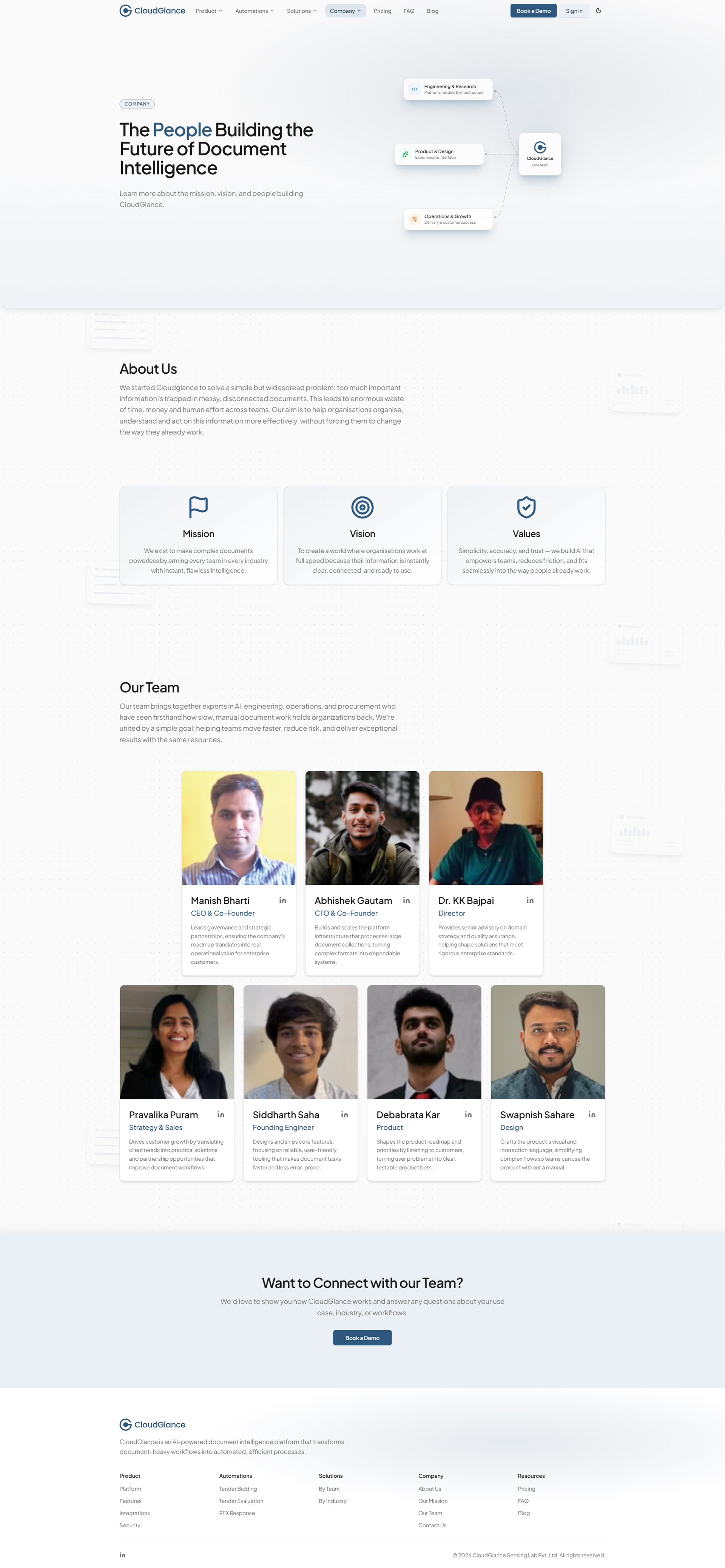
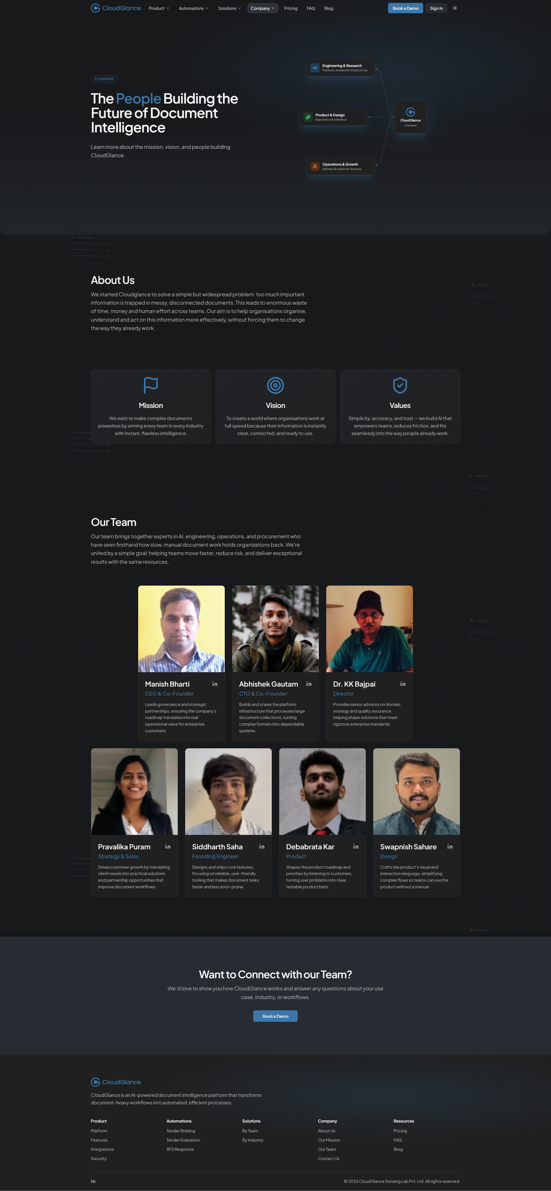
Company Page
The Company page carries the organisational context: an about section, a structured set of Mission, Vision and Values, and a team section introducing the people behind the platform. It holds the same calm tone and visual rhythm as the rest of the site, and closes with a call-to-action that points forward.
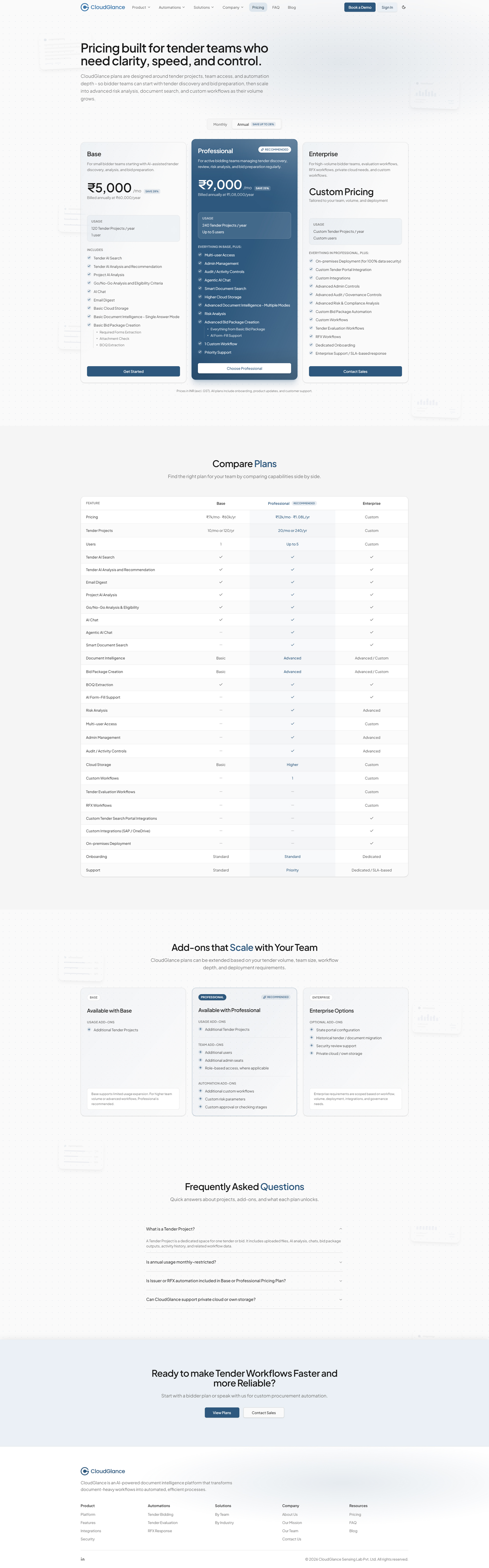
Pricing Page
Pricing is a design problem before it is a page: three plans, a long list of capabilities, and a buyer who needs to place themselves quickly. I built it to make the choice legible at a glance - a set of plan cards for the fast read, a full comparison table for the careful one, an add-ons section for the specifics, and a pricing-focused FAQ to catch the questions that stop a decision.
It sits on the tertiary template, a page header over a stack of the same blocks, proof that even a dense, commercial page didn't need a layout of its own.
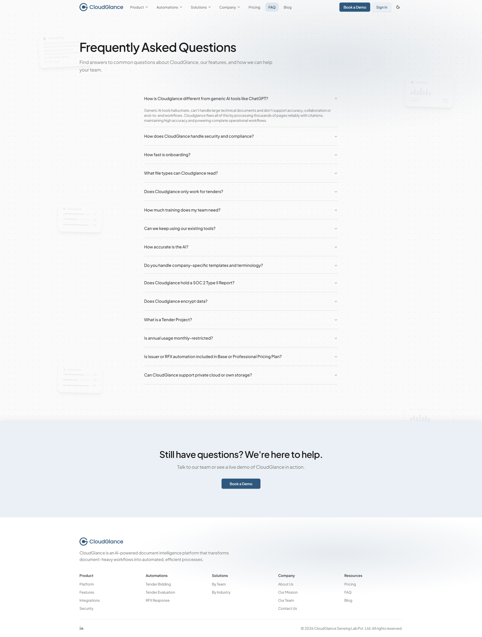
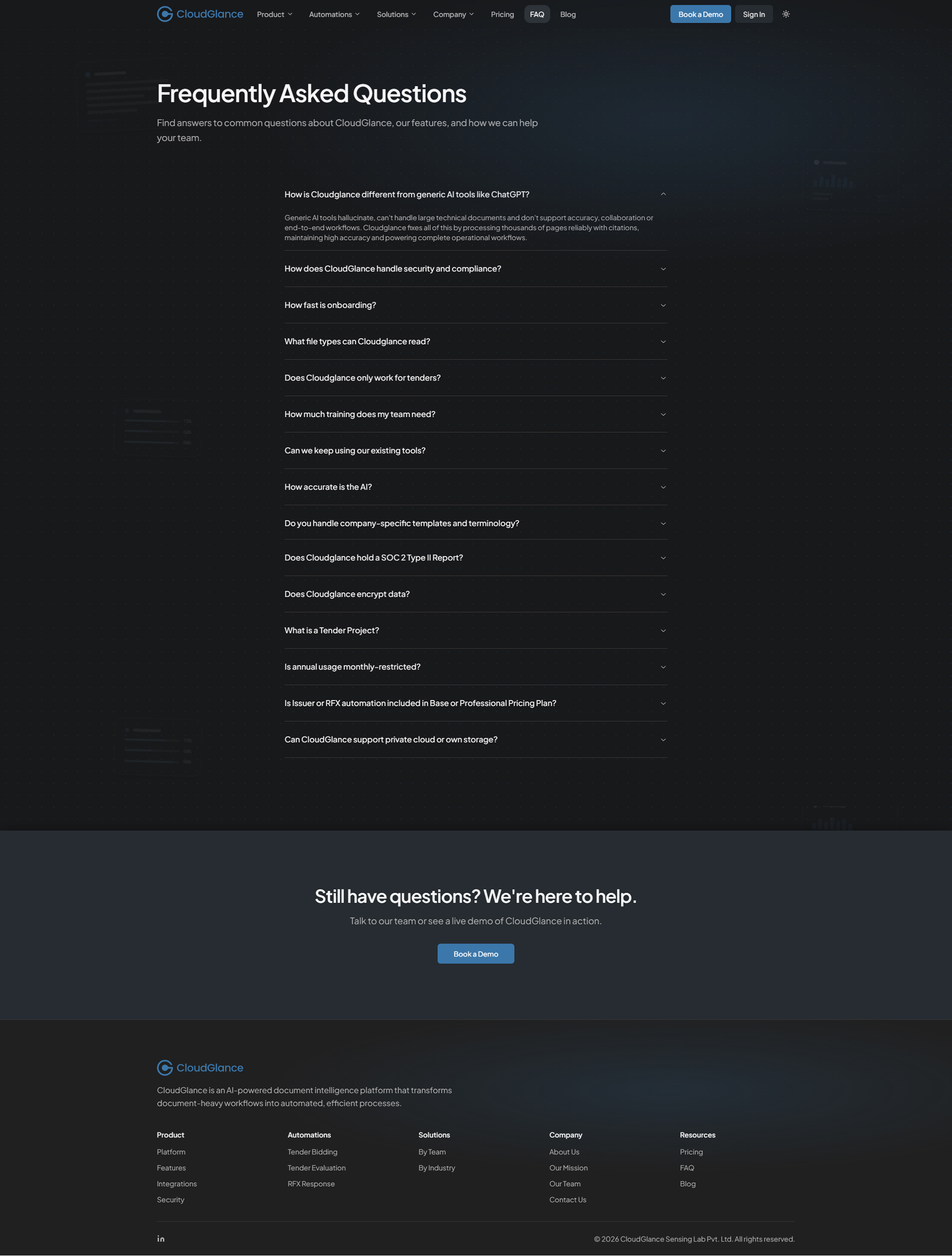
Support Pages - FAQ & Contact
The FAQ page presents common questions in a clean accordion beneath a simple header, easy to scan, with a closing call-to-action for anyone who wants to go further.
Contact is the one deliberate exception to the site's rhythm - a two-column, functional layout with the essentials on one side and a minimal form on the other, and no closing CTA, because it is where the journey is meant to end, not continue.
FAQ
Contact
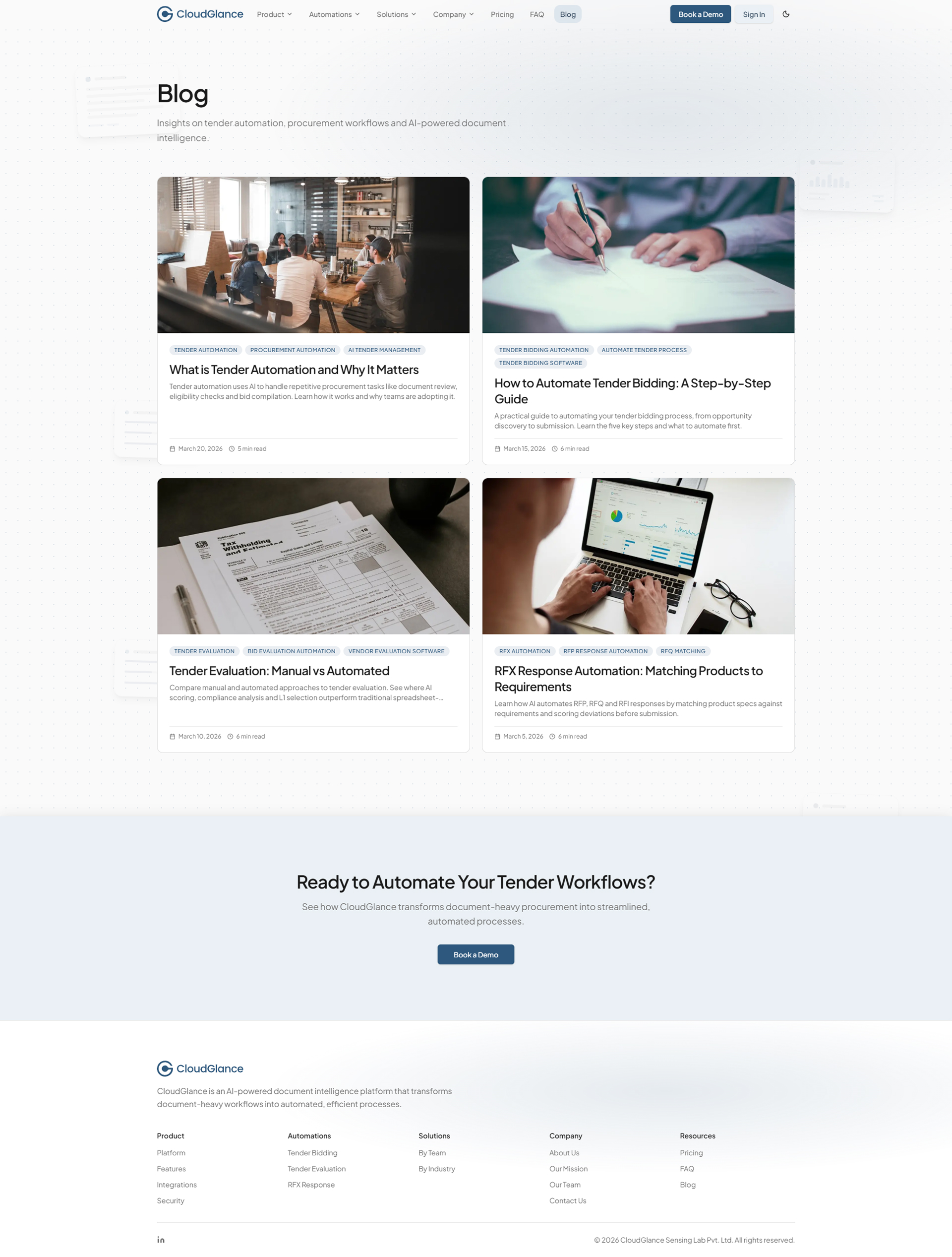
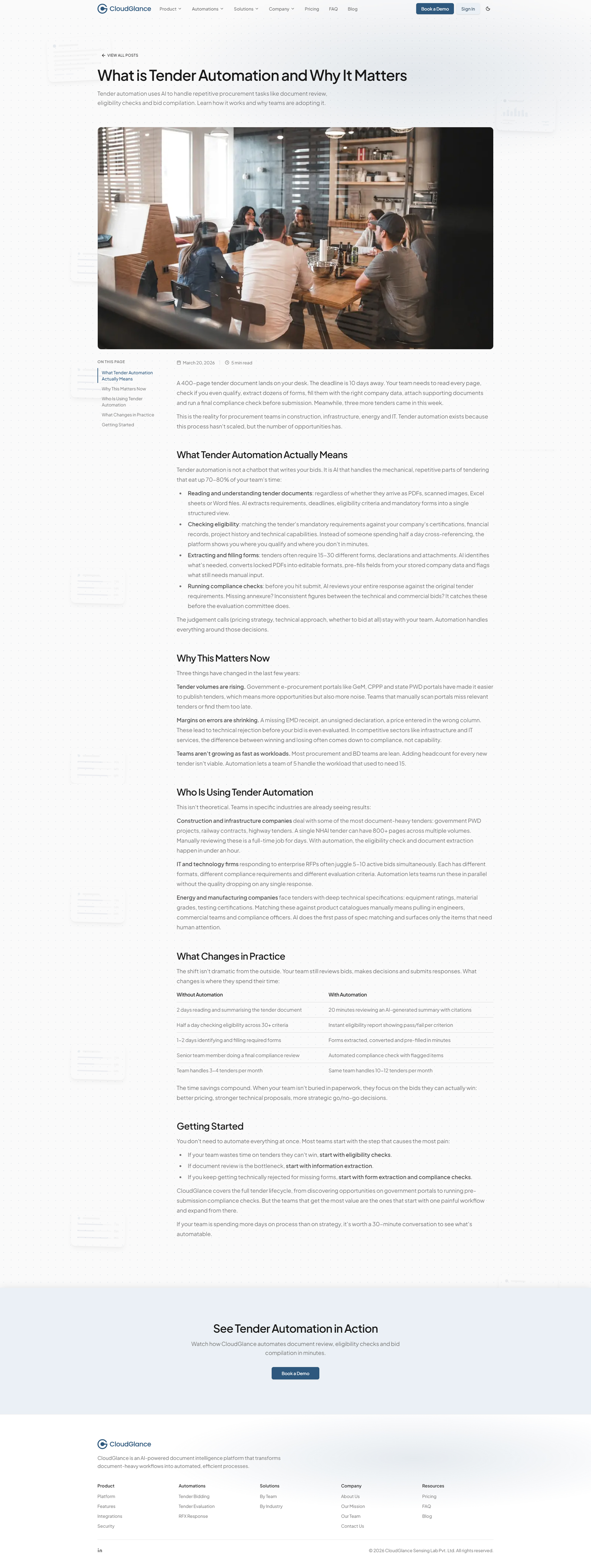
Blog
The Blog extends the system to owned content. It runs on its own lightweight template, an index of articles and a clean reading layout with a table of contents and reading time, built so the library can grow one post at a time without touching anything around it.
It is a small proof of the same idea running through the whole project: when the structure is right, adding a new kind of content is a matter of filling it in, not building it from scratch.
Blog index
Blog article
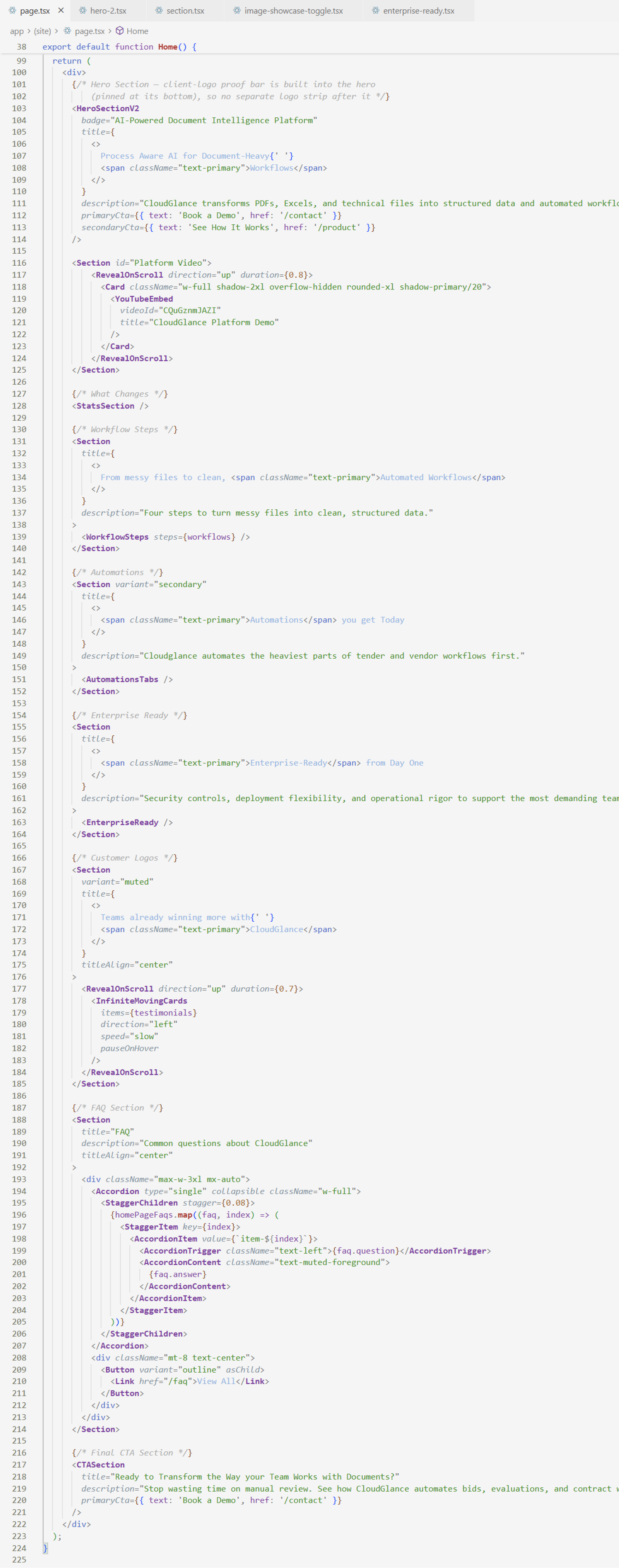
Front-End Build & Craft
Designed and built by the same hand - so nothing was lost in translation.
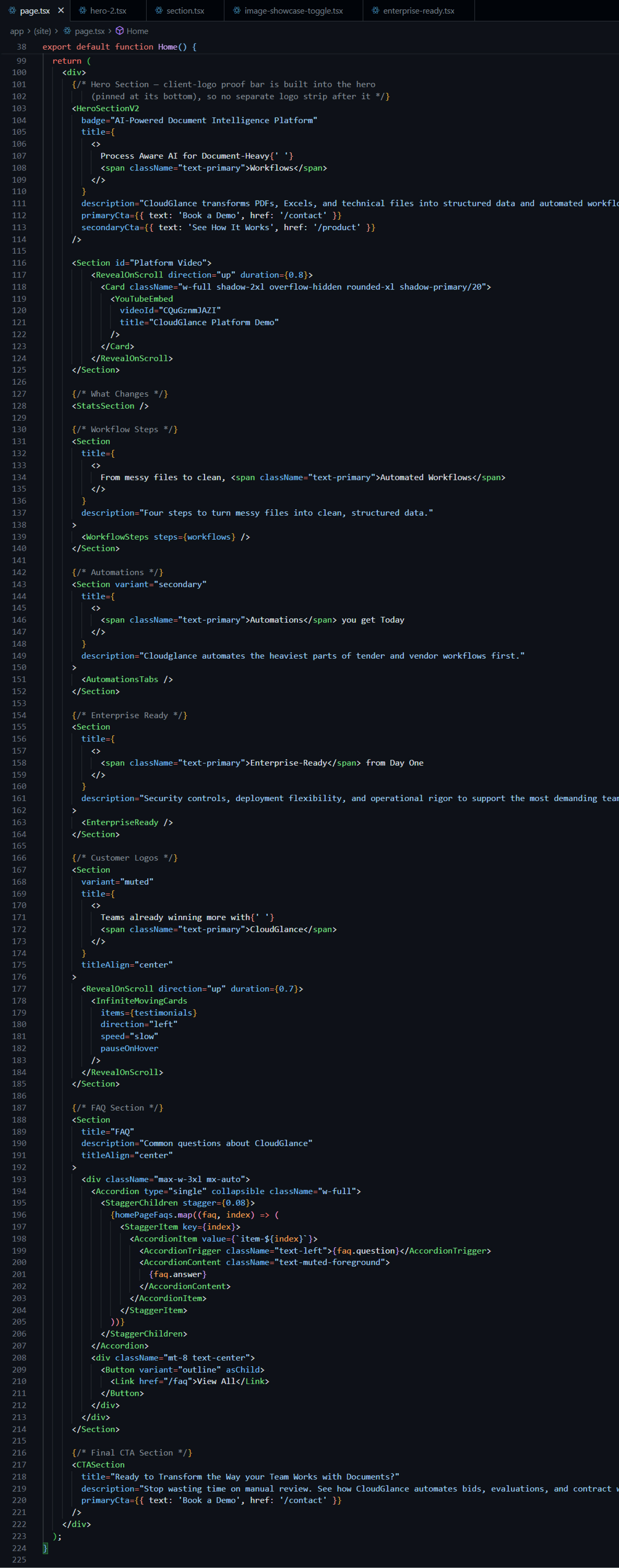
I developed the entire website myself, turning the design system directly into a production build. Working in Next.js, React and Tailwind CSS, every section exists as a reusable component that maps precisely to the design.
Design-to-Code Fidelity
Because I both designed and built the site, there was no gap to bridge between the two. Spacing, typography, colour and interaction carried across exactly, so the calm, structured feel of the design survived into the live experience. Cursor AI supported the workflow, but every decision about structure, components and polish was driven by the design system - the tooling sped the typing, not the thinking.
Discoverability - SEO, Structured Data & Social
A product site only works if it can be found and shared well, so I built that in as real work, not an afterthought. Every page carries tailored metadata, canonical URLs, keywords and Open Graph data; generated Open Graph and Twitter images give each link a considered preview; and a sitemap, robots rules, a web manifest and app icons round out the technical base. Structured data, Product and FAQ schema, helps search engines and AI tools read the pages accurately. It is quiet engineering, but it is the difference between a site that exists and one that gets discovered.
Search results, with sitelinks from the sitemap


An AI assistant reading and citing the site


Performance & Accessibility
Performance and accessibility shaped decisions throughout. Assets were optimised for fast loads, and the component-driven build kept the codebase efficient. Typography, spacing and contrast were chosen for long-form readability; motion was kept restrained and honours a reduced-motion preference; and interactive elements follow predictable focus states, keeping the site usable for a wider range of people and inputs.
Responsiveness
Responsive behaviour was planned from the start, not patched in - and on a document tool that people genuinely check from a phone, that mattered. Layouts adapt cleanly across breakpoints, the navigation collapses into a full mobile sheet, and dense sections like the pricing comparison and the automation showcases are recomposed for narrow, touch-first screens rather than simply scaled down. The hero is the clearest expression of the intent (three purpose-built forms across desktop, tablet and mobile), but the same care runs through every block, so the site stays stable and legible on any device.
Deployment
The site is built with Next.js and deployed on Vercel as a standalone production build, live at cloudglancelab.com. The result is a clean, modular front-end foundation that CloudGlance can extend as the product grows - the same scalability that shaped the design, carried through to how the site is shipped and run.
Outcome & Impact
The website gave CloudGlance a public presence that finally matched the depth of its platform - calm, structured, and clearly its own. It replaced a single-page placeholder with a system that explains the product, supports deeper exploration, and reads as credible to enterprise teams evaluating an AI tool for sensitive work.
But the part I value most is structural. By handling design and development end to end, I could build the site as two systems rather than a stack of pages: a page framework that any new page inherits from, and a motion layer that makes the product legible without a single screen feeling busy. Both were built to grow - and the site has already grown into them, absorbing a pricing page, a content library and new automations without a redesign.
The brand now reads consistently from platform to website, the codebase is clean and modular enough for CloudGlance to extend on its own, and what began as a redesign became the long-term foundation for how the company presents itself.
Reflection
Designing and building the website end to end reinforced something the platform work had started teaching me: the parts of a project make the most sense when one person can see the whole arc, from the first structural decision to the last line of code.
Because the same thinking ran from architecture to design to build, the site stayed coherent in a way that is hard to reach when responsibilities are split. The page templates, the block library, the motion system - none of them were separate deliverables. They were one continuous decision about how the site should hold together as it grows.
This project became less about making a website and more about aligning identity, product and communication into a single, continuous experience - and building it so that experience could keep expanding without losing its calm. That alignment, and the discipline to hold it across both design and code, is the kind of work I want to keep doing.